Why Every Plate at 36 Sakura Café Looks Like a Painting (And How to Actually See It)
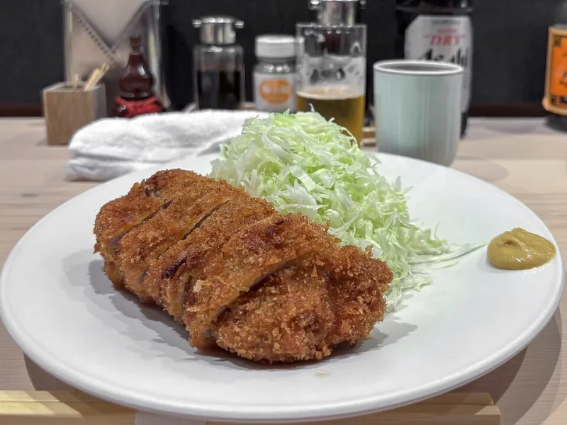
Photo: Dale Cruse from San Francisco, CA, USA, CC BY 2.0, via Wikimedia Commons
There's a moment that happens to a lot of first-time guests here. The food arrives, and before they pick up a fork, they just... pause. They might pull out their phone, or they might just sit with it for a second. Something about the plate stops them.
That pause is intentional. And it didn't happen by accident.
Japanese culinary tradition has long held that eating is a full-sensory experience — that the eyes eat first, as the saying goes. But the philosophy behind how a dish is plated in Japanese cuisine goes much deeper than making things look pretty. It's a practice rooted in centuries of aesthetic principles, seasonal awareness, and a genuine belief that beauty and nourishment belong together on the same plate.
The Principle That Changes Everything: Ma
If there's one concept that defines Japanese plating — and honestly, Japanese design across the board — it's ma. Loosely translated, it means negative space. The deliberate emptiness. The part of the plate that holds nothing.
In American dining culture, a full plate often signals generosity. We're wired to read abundance as value. But Japanese plating philosophy flips that instinct. The empty space isn't absence — it's presence. It gives your eye somewhere to rest, and it draws your attention toward what is there.
At 36 Sakura Café, you'll notice this in the way a small arrangement of pickled vegetables might sit in one corner of a wide ceramic dish, or how a single delicate garnish of sakura salt is placed just off-center on a piece of fish. That positioning isn't random. It's meant to create tension and release, the same way a good poem uses silence between words.
Color as a Seasonal Language
Japanese chefs — especially those trained in kaiseki, the traditional multi-course style — think about color the way a painter thinks about a palette. But here's what makes it different from Western plating conventions: the colors on the plate are meant to reflect the season outside the window.
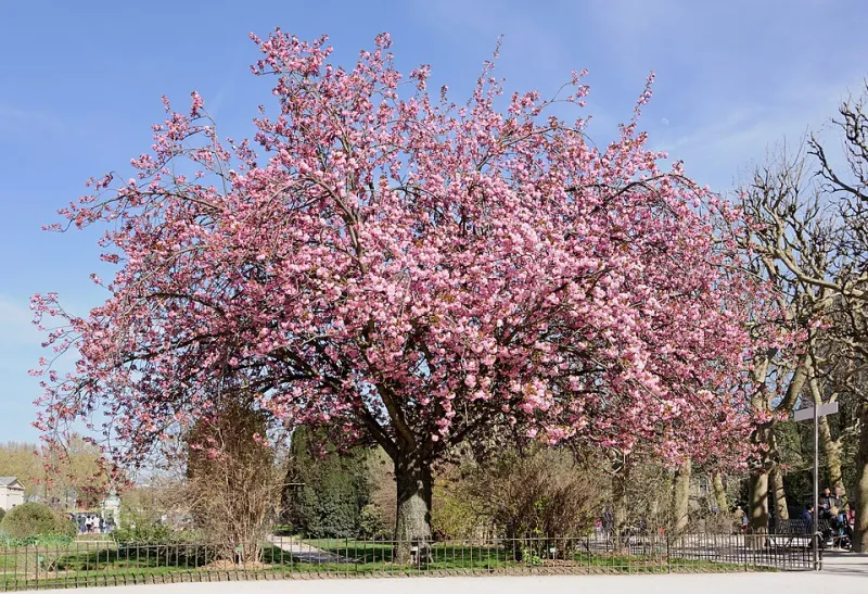
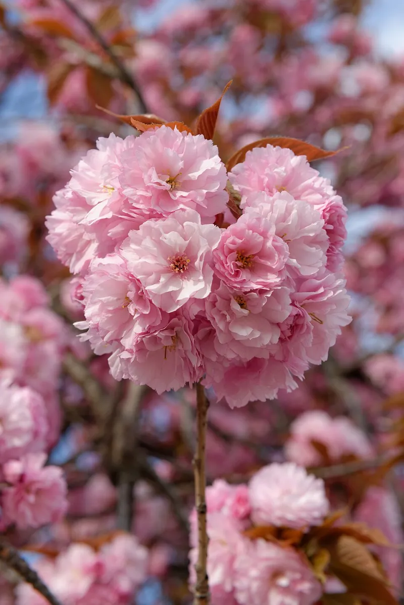
Spring calls for soft pinks, pale greens, and the creamy whites of cherry blossoms. Summer shifts toward deeper greens and vibrant reds. Autumn brings golds and burnt oranges. Winter goes quiet with muted earth tones and stark whites.
At 36 Sakura Café, we lean into spring as our permanent aesthetic anchor — it's right there in our name — but the way we use color is still intentional and layered. A dish might feature the blush of pickled sakura petals against the deep green of shiso, or the warm amber of a yuzu glaze next to the pale ivory of tofu. These combinations aren't just visually appealing. They're communicating something about freshness, about the season, about where the ingredients came from.
When you look at a plate through this lens, you start to read it like a sentence.
Vessels Matter More Than You Think
One thing that catches a lot of guests off guard is how much thought goes into the dishes themselves — not just what's on them. In Japanese dining culture, the vessel is considered part of the presentation. A rough-textured ceramic bowl conveys something different than a smooth lacquered one. A square plate creates a different visual conversation than a round one.
This is why you'll notice that not everything at 36 Sakura Café comes out on matching white china. Some dishes arrive in handcrafted ceramics with irregular edges. Others come in small wooden boxes or on flat slate-style plates. Each choice is made to complement the food — its texture, its temperature, its mood.
The Japanese term for this practice is utsuwa, which roughly translates to "vessel" but carries a broader meaning: the idea that the container and the contents are in conversation with each other. A light, delicate dish deserves a light, delicate plate. A hearty, grounding dish might come in something heavier, more tactile.
The Symbolism Hidden in Garnishes
Here's a small thing that carries a lot of meaning: the garnishes. In Western cooking, garnishes are often decorative afterthoughts — a sprig of parsley, a lemon wedge. In Japanese plating, they're almost never arbitrary.
A curl of yuzu zest might be placed to evoke the shape of a wave. A scattering of sesame seeds might mirror the pattern of falling blossoms. A single edible flower might be chosen not just for its color but for its seasonal symbolism — certain flowers in Japanese culture are associated with specific emotions, virtues, or times of year.
At 36 Sakura Café, the sakura petal — real or represented — shows up across the menu in different forms precisely because of its symbolic weight. In Japan, cherry blossoms represent the fleeting beauty of life, the idea that what is most precious is also most temporary. When a dish carries even a small nod to that symbol, it's inviting you into that feeling.
It sounds heavy for a Tuesday lunch. But somehow, it isn't.
How to Actually Appreciate It at the Table
You don't need a design background or a deep knowledge of Japanese aesthetics to appreciate what's happening on your plate. You just need to slow down for a second before you dig in.
Take a look at where things are placed. Notice whether the plate feels balanced or intentionally off-balance. Pay attention to the colors — do they feel harmonious? Do they tell you something about the season or the ingredients? Look at the garnish and ask yourself whether it's doing something beyond just sitting there.
And then eat, of course. Because ultimately, all of this visual intention is in service of the food itself. The plating at 36 Sakura Café isn't about performance or pretension. It's about the same thing the cherry blossom has always been about: slowing down long enough to notice something beautiful before it's gone.
That pause when the plate arrives? That's exactly the point.